BASIC REPORTS
SESSION REPORTS
Number of Sessions:
A session is one use of the application by an end user. This typically begins when the application is launched and ends when the application is terminated.
Total Sessions is defined as the sum total of sessions obtained within the selected date range.
Unique Sessions shows the count of users. Multiple sessions coming from a single device is limited to one.
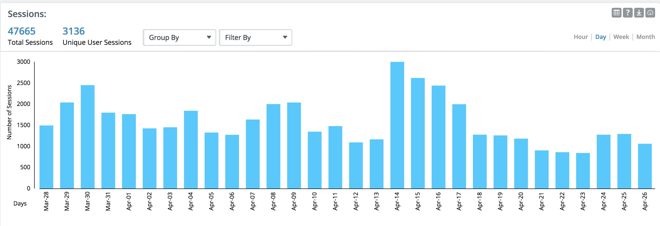
Sessions
This graph plots the number of sessions that have occurred over time. Choose preferable time bucket to view data hourly, daily, weekly or monthly. You can limit the data using filter option or use the group by feature to split data on the selected parameter.
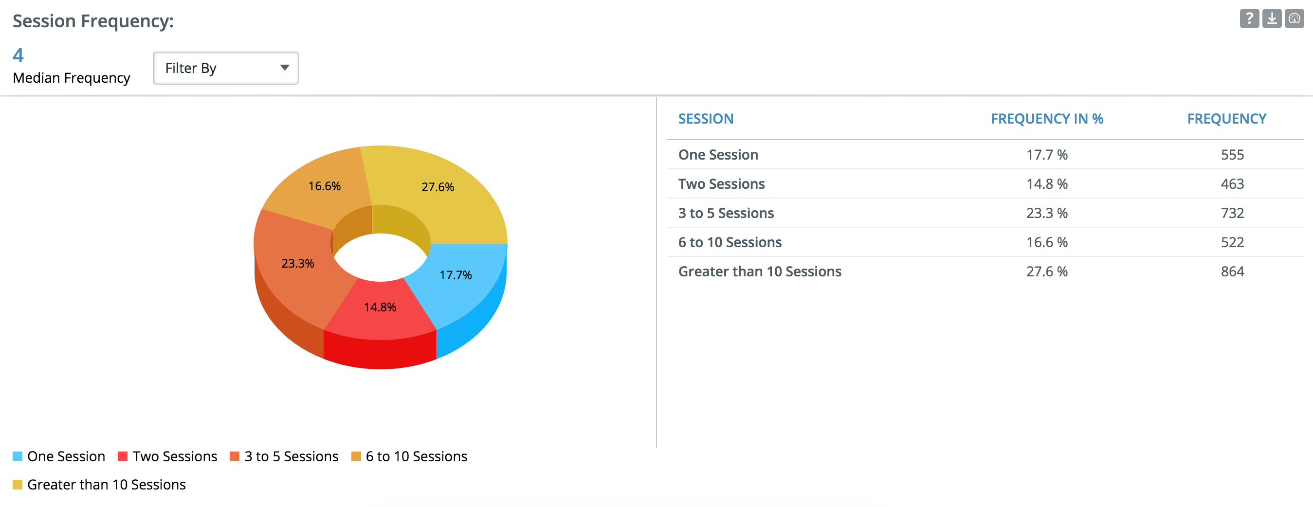
Session Frequency:
The pie chart shows the frequency of the app usage for the selected date range.
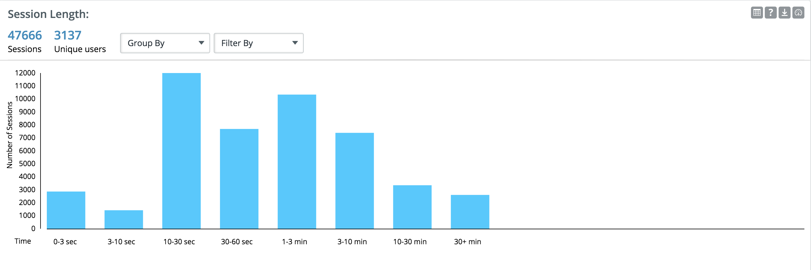
Session Length:
Session length is defined as the time spent by user in the app for every session(Typically the time between App open and App close). There are instances where end of session is not recorded for e.g. in the case of a crash. Such cases are excluded in the calculation.
This chart shows the distribution of sessions by session length
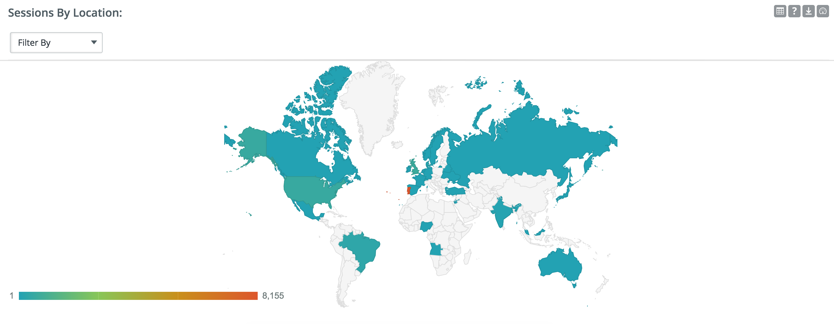
Sessions by location:
Session by location gives you a snapshot of sessions captured from various locations and plotted on a world map.
RETENTION REPORTS
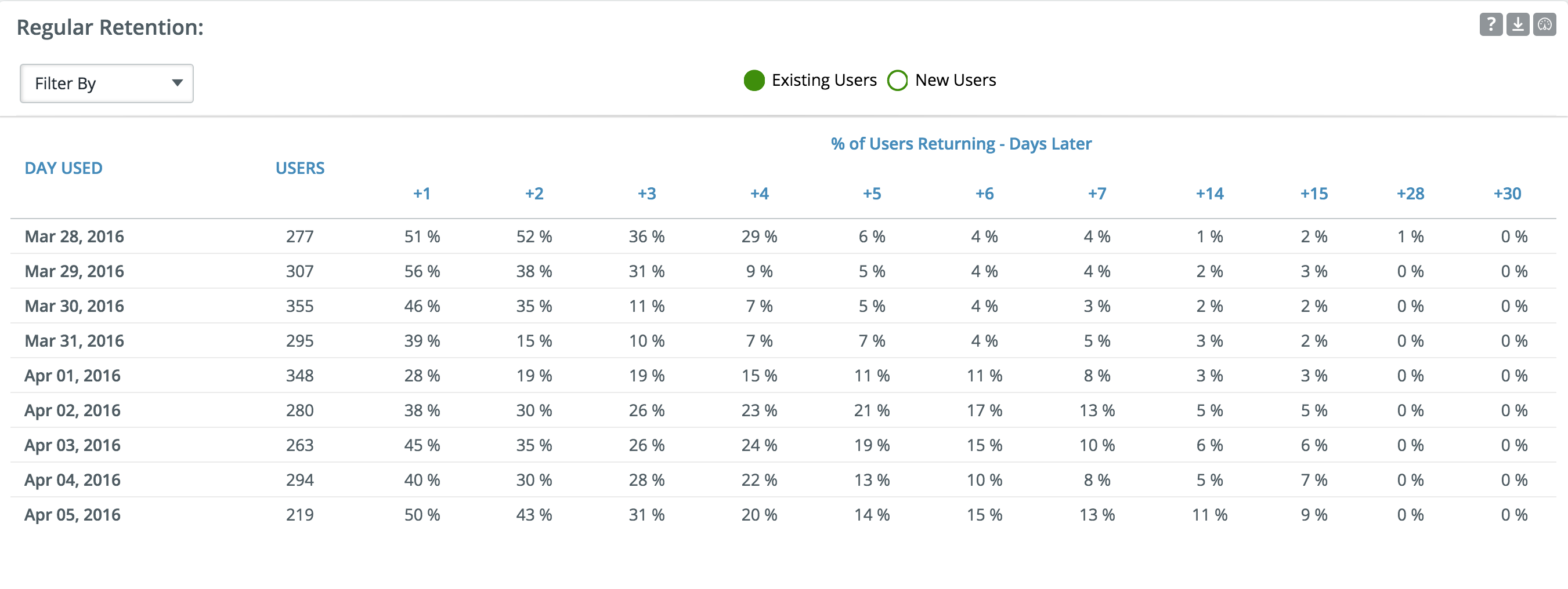
Regular Retention:
Regular retention measures the percentage of users who return to the app after N days. You can select one of the two options below:
- Existing Users: It measures the percentage of users who return to the app on a specific day after having at least one session on day 0. For e.g if 100 users opened the app on day 0 (cohort size = 100) and 30 of them had at-least one session on day + 1, then value on day+1will be 30%.
- New Users: The cohort in this case will only be users who installed the app on day 0.
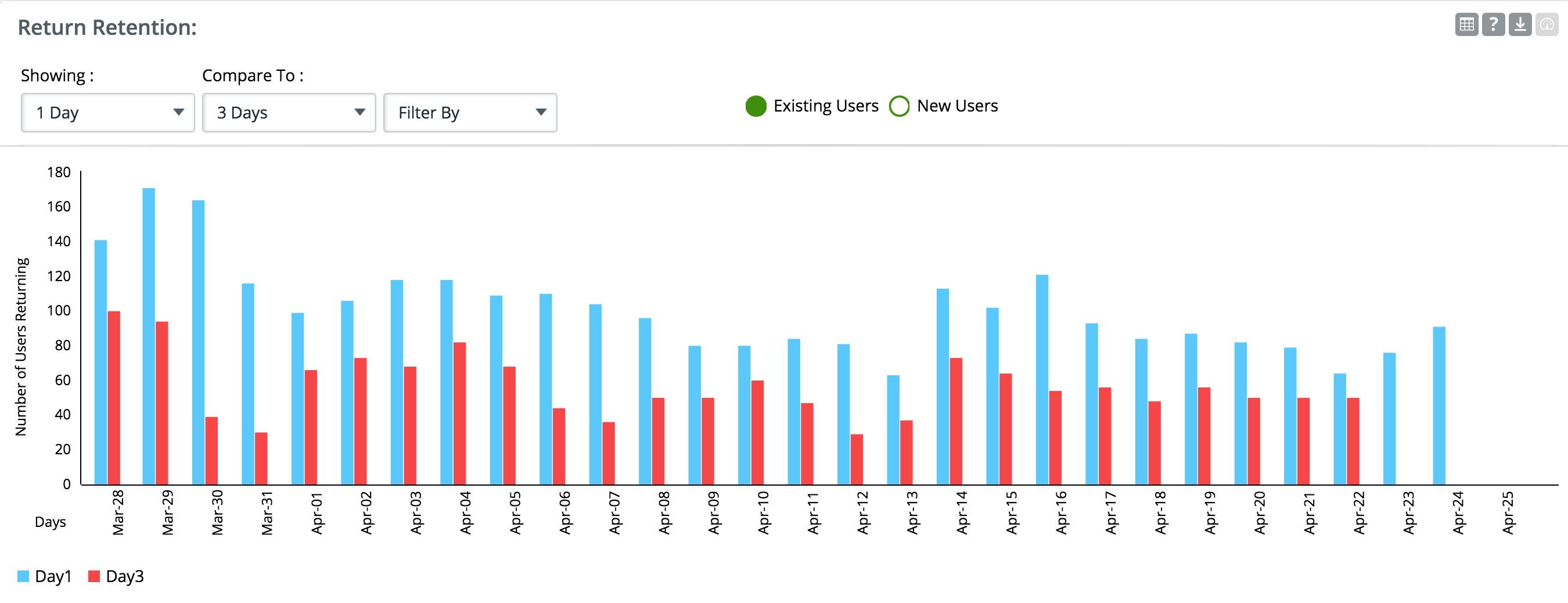
Return Retention:
Return rate measures the percentage of users who return to the app after N days. You can select one of the two options below:
- Existing Users: Return rate measures the percentage of users who return to the app on a specific day after having at least one session on day 0. For e.g A day 1 return rate will be 30% , if 100 users opened the app on this day(cohort size = 100) and 30 of them had at-least one session on the next day.
- New Users:It will measure return percentage only for users who installed the app on day 0.
You will have no data for recent dates for e.g. for today, we don’t have data on today + 7 days. The compare to drop down can be used to compare two return rates for each of the dates.
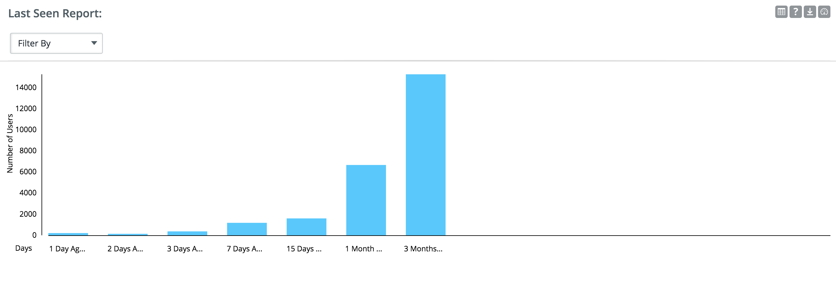
Last Seen Report:
This report will display data of last time a user opened the app. The data in this report will be for all users since day 1. The time filter will not be applicable to this report.
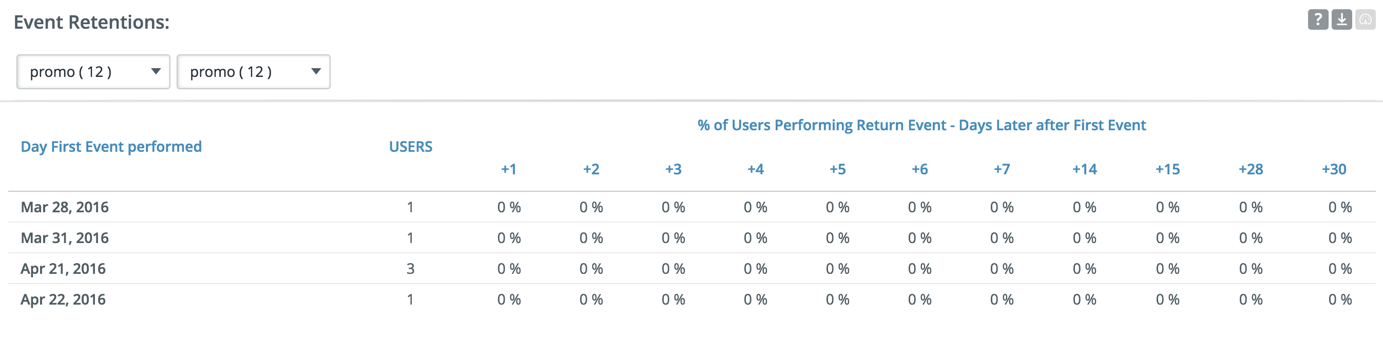
Event Retention:
The report will give data on number of users who came to the app to do an event, returned later to do another event.
Full Retention:
Users who came to the app on day 0 and every following day till day n. This is the most strictest form of app retention as a user is considered lost if the app is not opened even a single day between day 0 and day n.
SCREEN VIEW REPORTS
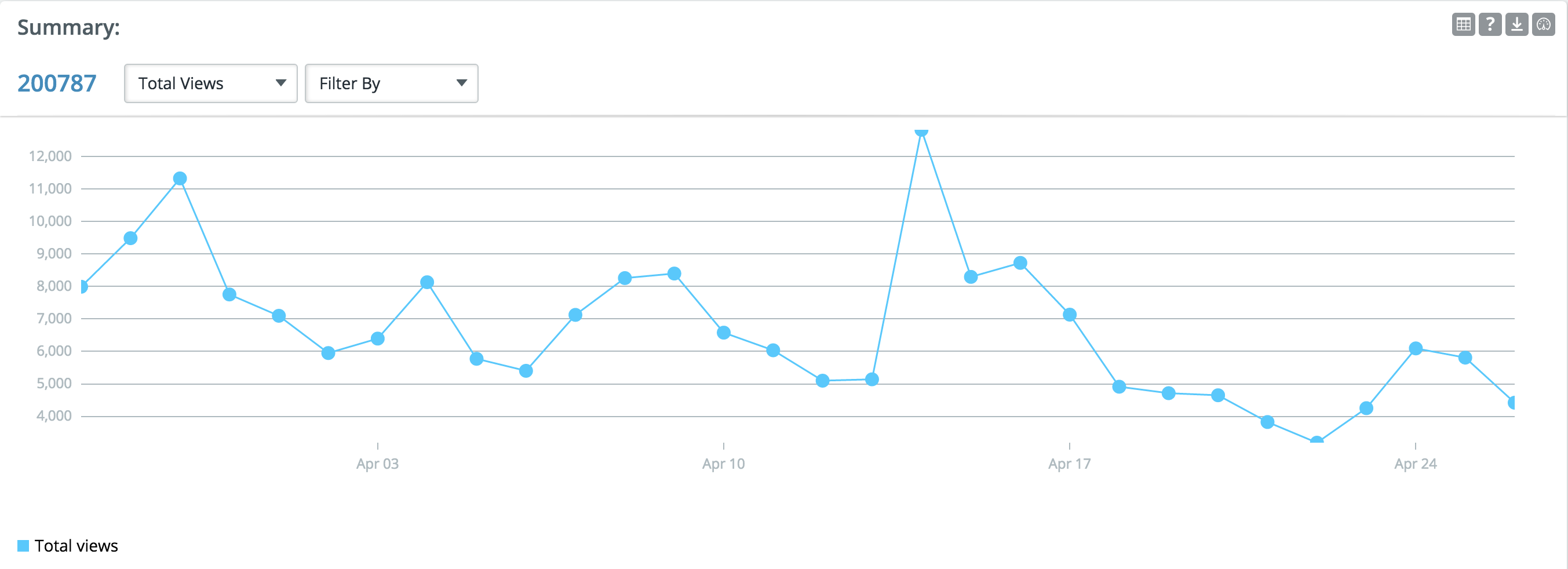
Summary:
This report helps you look at the total views which is the number of times a screen in your app is viewed. It dose not signify the number of users but only the number of views on a screen.
Unique views which gives you the number of unique user views for that screen on a day. For example, if a person viewed a single page 100 times during the same visit, that page would show 100 “screen views”, but only one "unique view".
Average Time: It is the total time users spent on the screen divided by the total number of views.
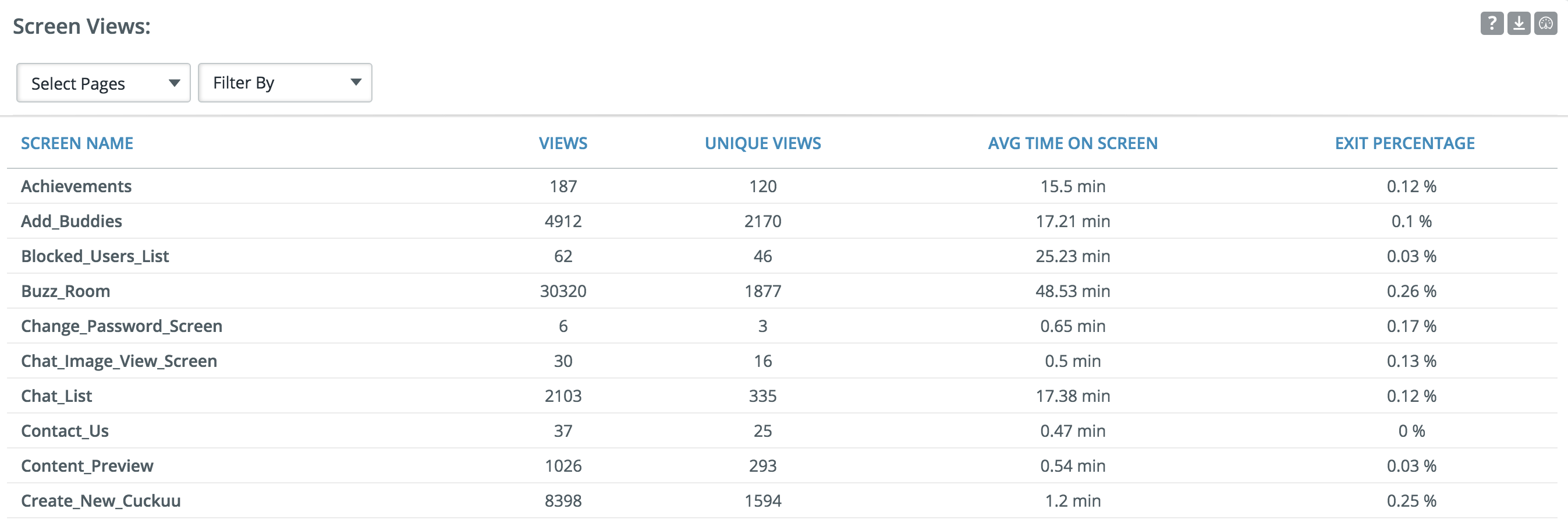
Screen views
This report will help you just focus on screens that matter. Use the dropdown to select the screen for which detailed view is expected.
Views
The sum total of views obtained on the screen within the date range
Unique Views:
A unique screen view shows you the unique screen views for the selected time period.
Average Time:
It is the total time users spent on the screen divided by the total number of views
Exit percentage calculates the number of sessions that ended on a screen.
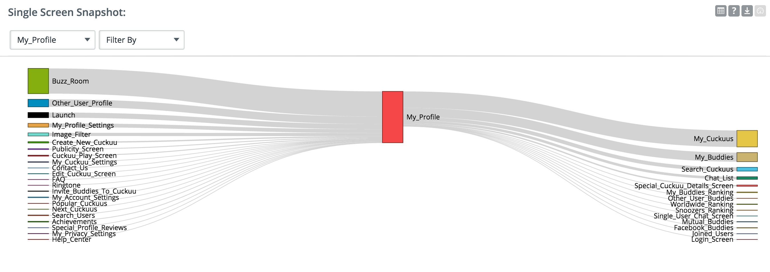
Single screen snapshot:
Select a screen in your App to see how many user views are coming from various screens to the selected screen and from the selected screen to other screen in the App.
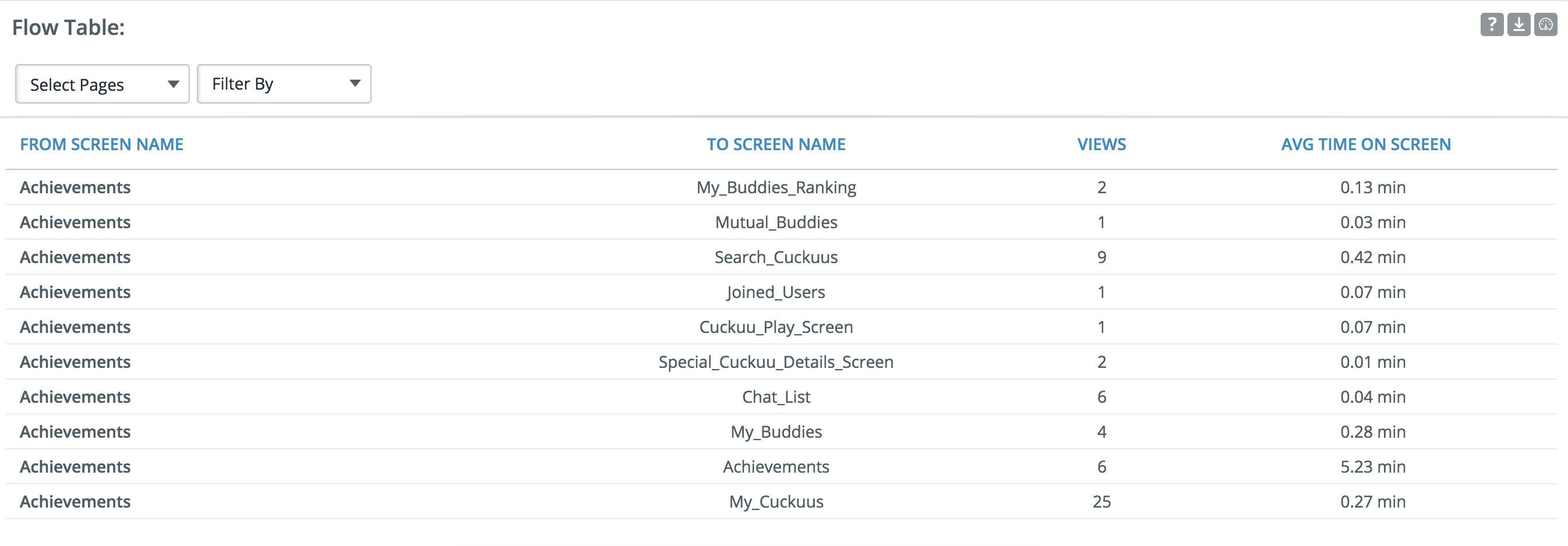
Flow Table:
View count is the count of screen-views navigated “from screen” to “to screen”.
Average time on the screen is the average value of time spent on the screen.
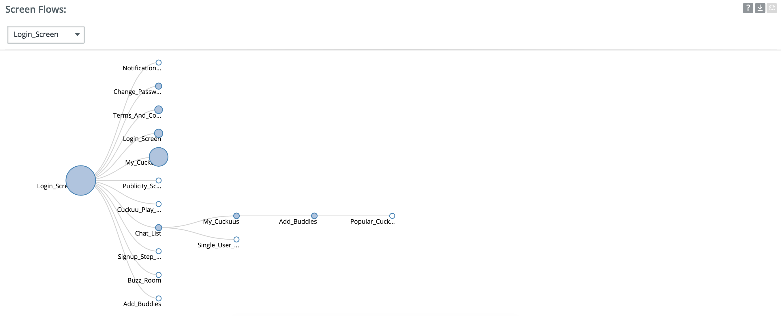
Screen flow:
The screen flow is restricted to five levels of hierarchy. Select the screen to fix the starting point for the flow. Traffic percentage at a page is the percentage of views at this page out of the total views at the source.
For e.g. 2 out of 100 views navigate to page B from A, traffic at B is 2%.
AUDIENCE REPORTS
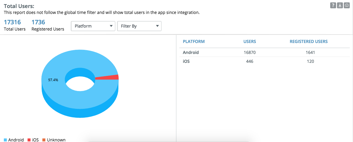
Total User Report:
This report does not follow the global date filter and will show total number of installs and registered users in the App since integration.
Please note,
- The users that download the app but do not open the app are not considered as the report only considers if the user has a session.
- Every time a user un-installs and re-install the app it will be considered as a new install.
- Registered users count will displayed only if the app has a registration section and is being captured while SDK integration.
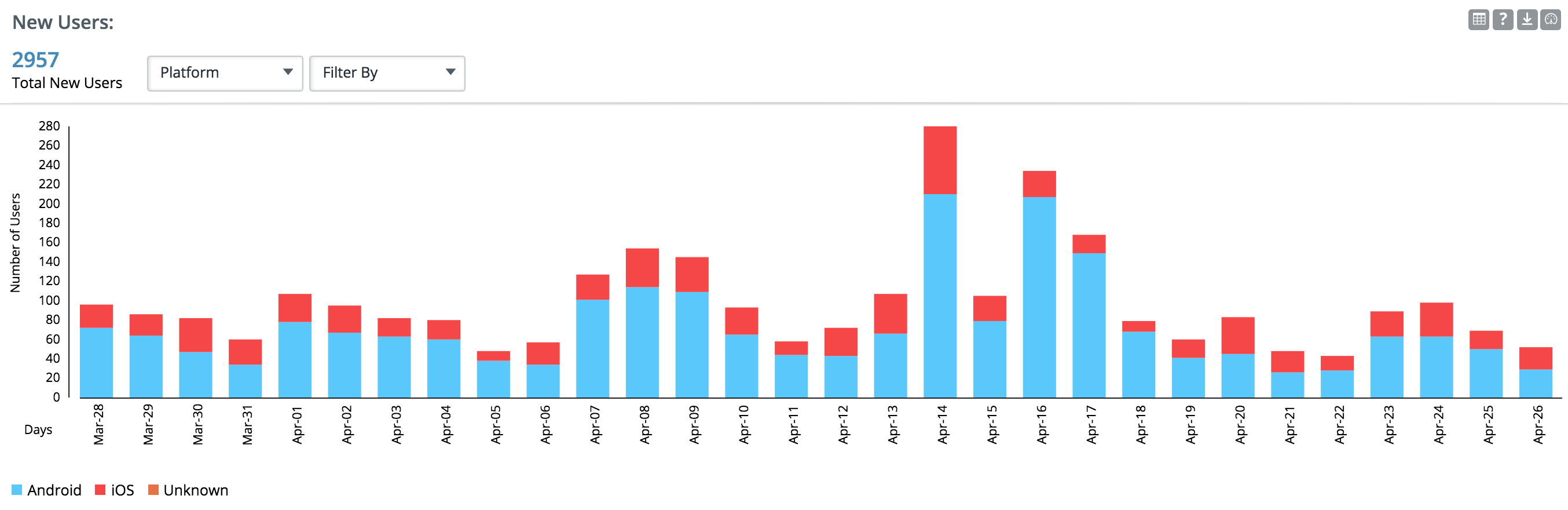
New User Report
A new user is a user who has just started using your application, i.e., the first session from the user is recorded. This graph plots the number of new users over time. A user for Upshot is an install in the app. The first launch of the app will be recorded as a new user. So if a user installs the app but never opens it, that user will not be recorded here.
The total new users displayed on top of the graph is the total of new users the app got in the selected date range.
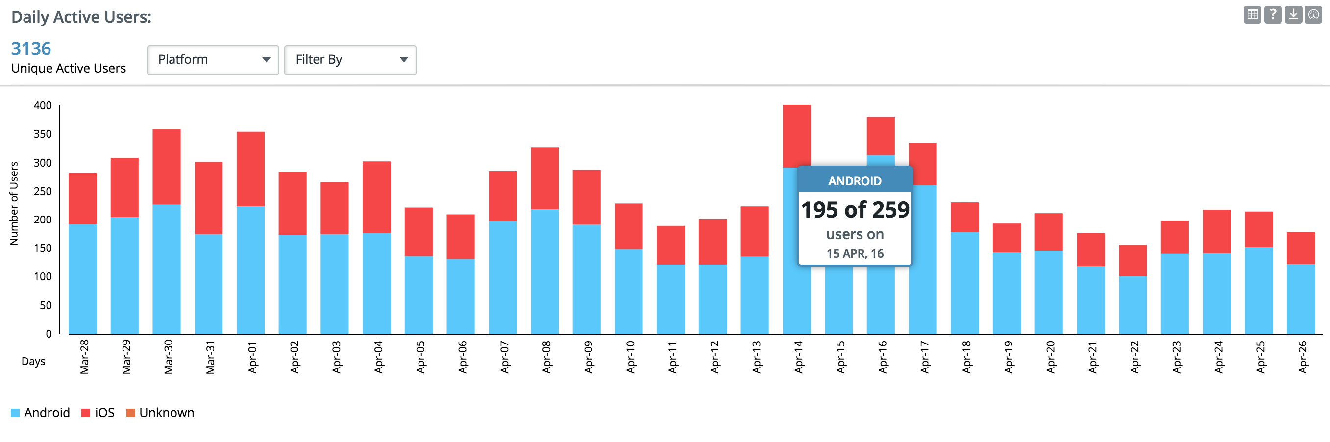
Daily Active Users
A daily active user is a user that has at least one session on that day. This report will provide the daily active users view based on a date range selection
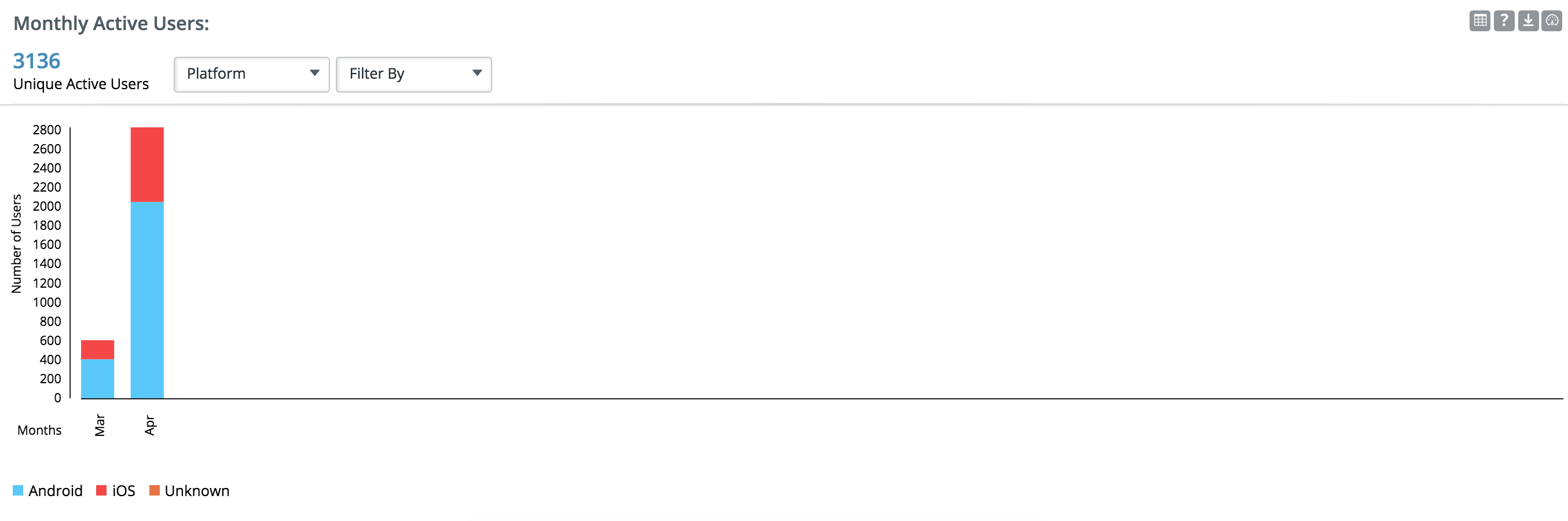
Monthly Active Users
A monthly active user is a user who has had at least one session in that month. This report will provide the monthly active users view based on a date range selection.
Even if the date range selected is from mid of a month MAU report will still consider the entire month while displaying the graph.
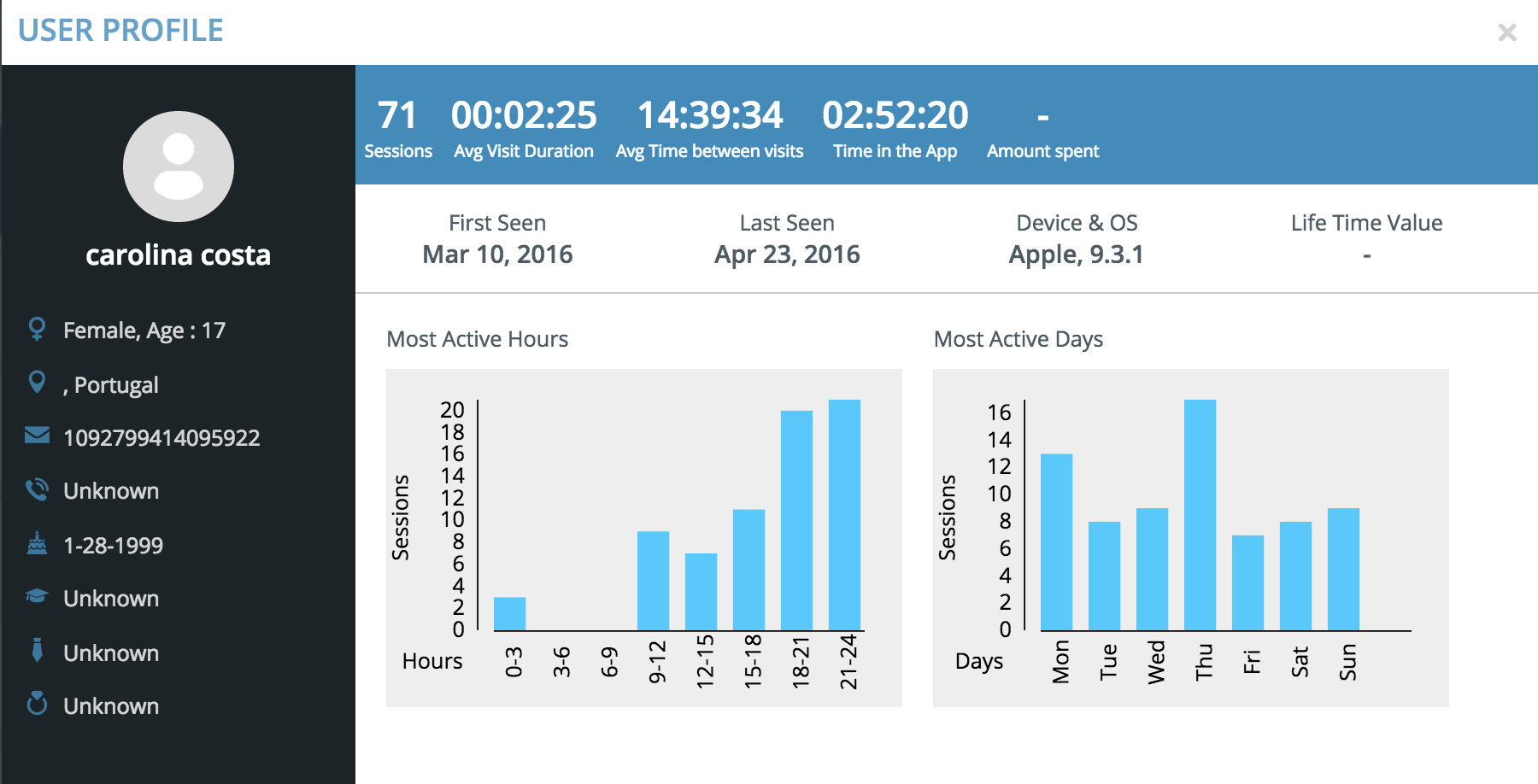
USER PROFILE REPORTS:
This report allows you to view granular details of the users from a selected segment
User details include only the data that is being captured while integrating the SDK and if the respective filed is not captured then it will be displayed as Unknown.
Name,Age,Location,Email,Phone number,Date of Birth,Qualification,Occupation,Marital status.
Sessions: Number of sessions by that user.
Average Visit Duration: Total time spent in the app/ Number of sessions.
Average Time Between Visits:
Time In the App:Total time spent in the app.
Amount Spent: Money spent by the user in the app through In-App purchases.
First Seen: The date when the app was first opened.
Last Seen: The date when the app was last opened.
Device and OS: Device used by the user and OS of that device.
Life Time Value:
Most Active Hours: The graph shows the time during a day when the user was most active and number of hours spent in the app at that time.
Most Active Days: The graph shows the days in a week when the user was most active and number of sessions he had on that day.
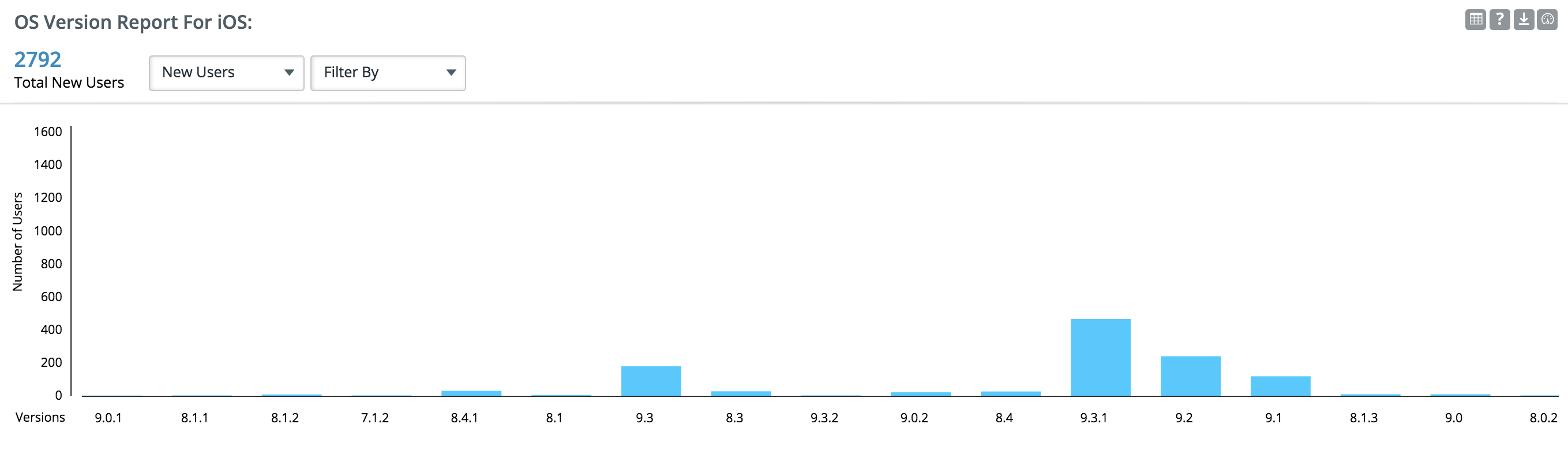
DEVICE/OS REPORTS:
These reports give information about different kind of devices, os versions and the OEM details of devices used by the users. Use the group by option to group data by an attribute and filter by option to limit data.
Each report can be grouped by All Users, New Users and also by Screen Views
Os version report for IOS:
This report will display number of users using different versions of IOS.
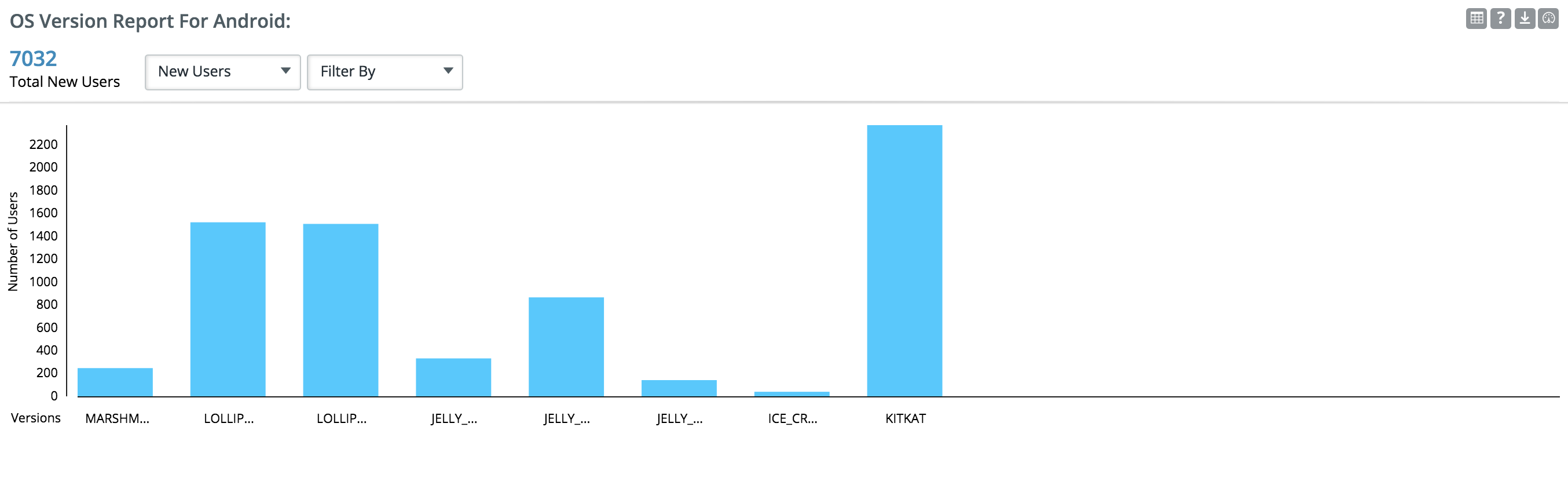
Os version report for android:
This report will display number of users using different versions of Android.
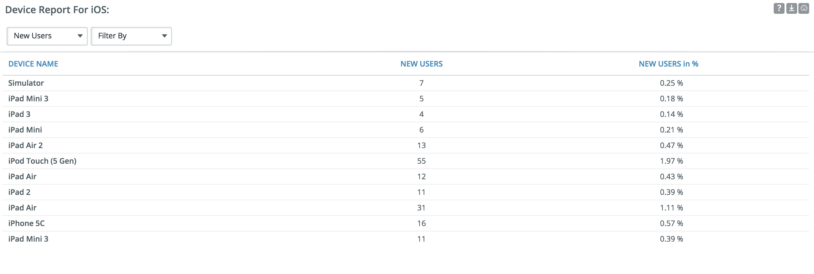
Device report for IOS:
The table shows distribution of users across various device models of Apple.
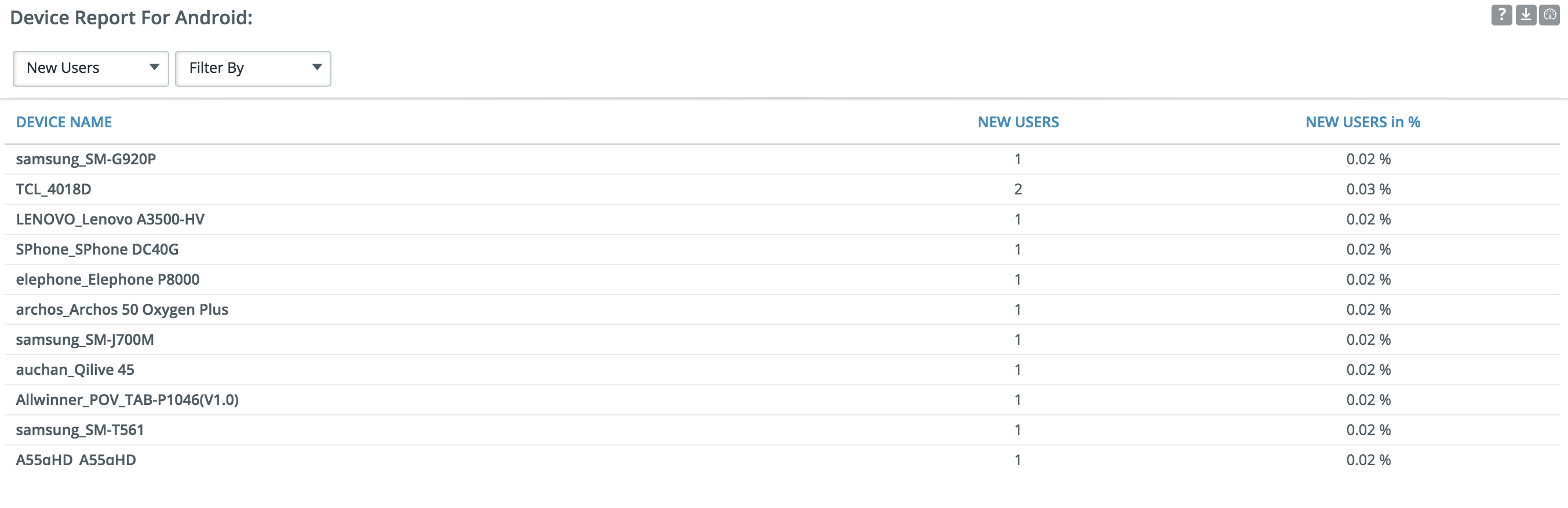
Device report for Android:
The table shows distribution of users across various models of Android devices
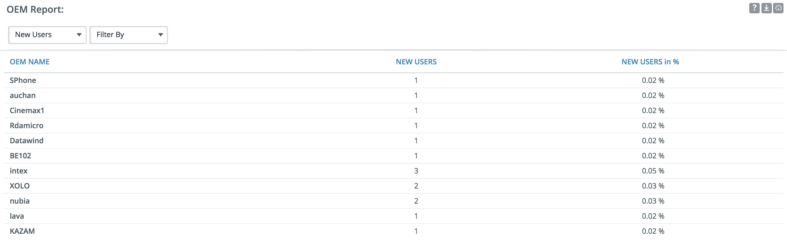
OEM report:
The table shows distribution of users across OEM.
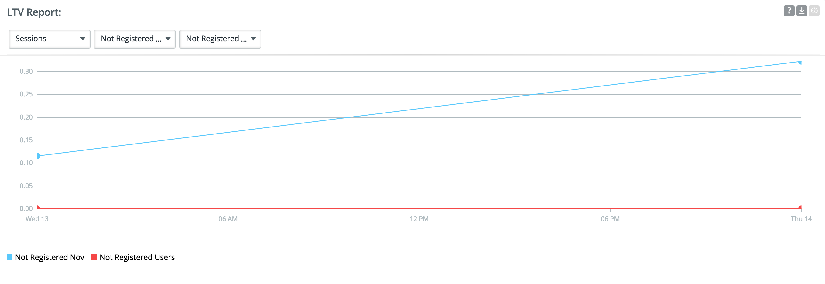
LIFE TIME VALUE REPORT:
This report helps to view the life time value of your users bases on Sessions. Screen views. Total time in the or Revenue generated... Choose segments to compare life time value for two group of users.
For eg : Compare the life time value of users from two different geographic locations.
REVENUE REPORTS:
Revenue reports are probably the most important analytics for any application. They help the publisher to understand where the revenue generated is coming from, and how your app performed in the selected date range.
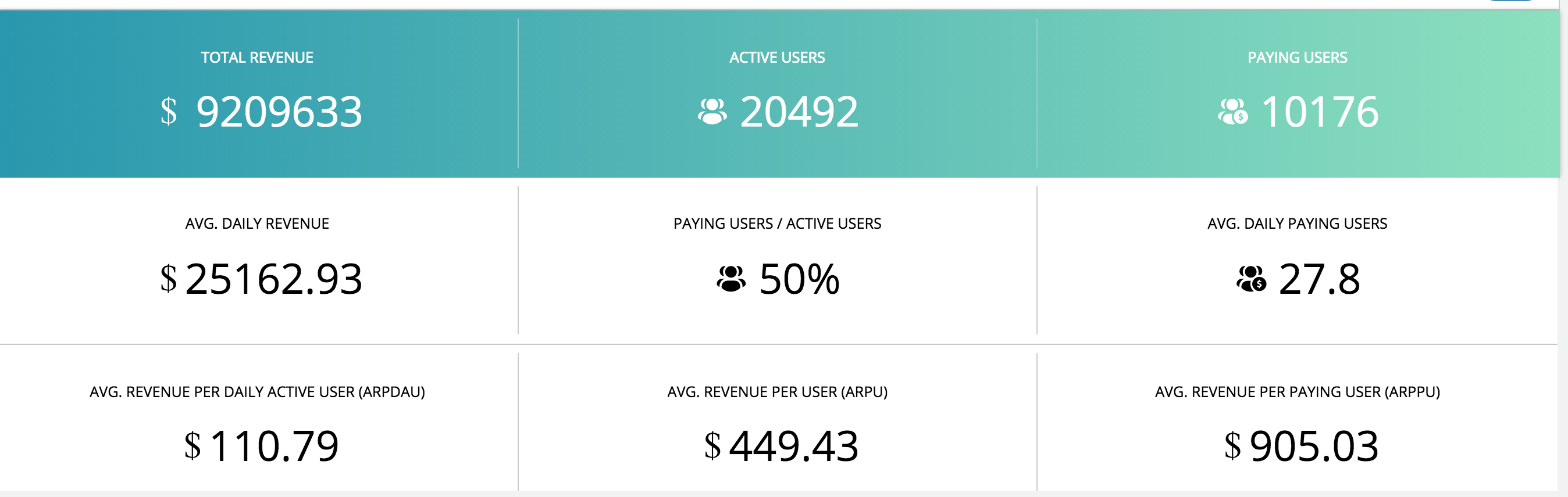
Revenue summary:
Gives you following metrics
Total Revenue:
Total revenue generated in the selected date range.
Active Users:
All the users who had at least one session in the selected date range.
Paying Users:
Users who are contributing to the revenue generated. For example users who purchase the paid version of the app.
Percentage of Paying Users/ Active Users:
Percentage of paying users by total active users of the app.
Average Daily Paying User:
Total paying users/ Number of eligible days in the period.
Average Daily Revenue:
Revenue in time frame/ Number of days.
Average Revenue Per Daily Active User(ARPDAU):
Average Daily Revenue/Average DAU
Average Revenue Per User(ARPU):
Total revenue in time frame/Active users in time frame
Average Revenue Per Paying User(ARPPU):
Total revenue in time frame/ Paying users in time frame
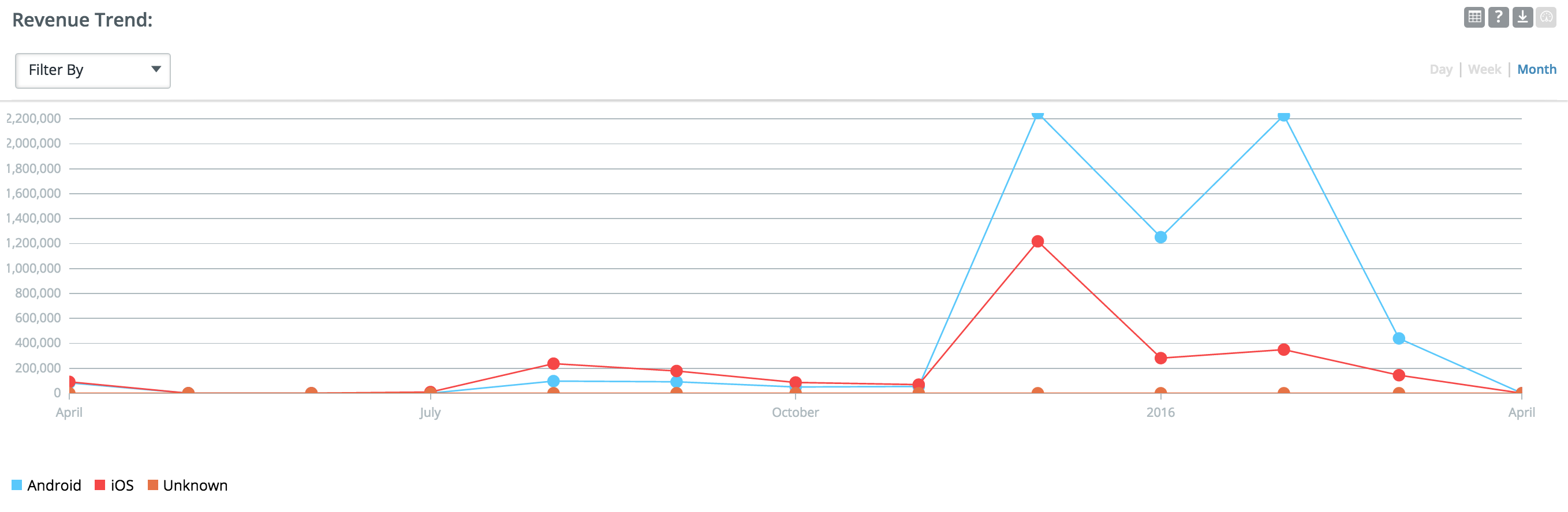
Revenue trends:
The graph shows data about revenue earned in the last 30 days. Use the filter by option to filter data based on attributes in the dropdown. View data by day/week/month by selecting the option on top right corner.
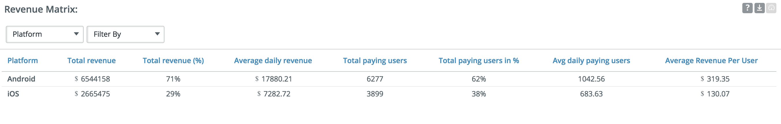
Revenue matrix:
The table shows the metrics in the revenue summary grouped by a attribute. Select the attribute for group by from the drop down. Use filter by option to limit your data.